© Ru Jia 2017 All rights reserved.
ALIPAY CASHLESS WEEK
Alipay offered the chance to own a share in 18,888g of gold per day for the use of its mobile app to make payments between August 1 and 7, and 88,888g on August 8. It was aimed to push forward the construction of Cashless Society in China and grab more market share.
To comply with my non-disclosure agreement, I have omitted and obfuscated confidential information in this case study. The information in this case study is my own and does not necessarily reflect the views of Alipay.
Date
June 28 - Aug 8
2017
Team:
Alipay UX Design
(Business Design Group)
Responsibility
User Research, Interaction Design, Visual Design, Quality Assurance
Background
About Alipay
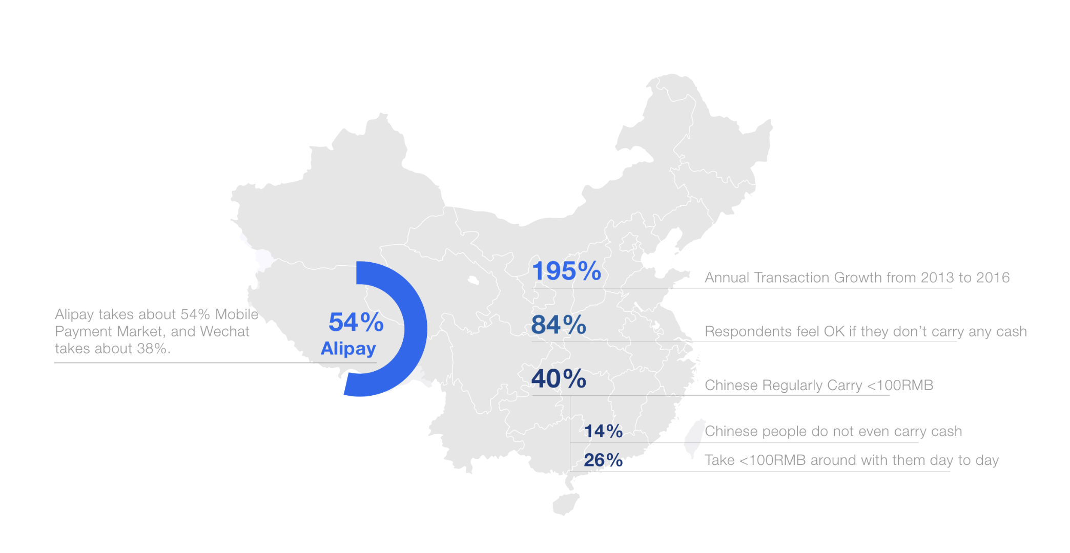
Alipay takes about 54% of mobile payment market share in China, while Tecent takes about 38%. The competition between the two giant is fierce. Promotions are necessary in this competition.
About Cashless Week
8 is pronounced as "ba" which is similar with "fa", meaning make fortune. Alipay made use of this tradition to create its featured promotion. From August 1st to 8th, 2017, Alipay offered the chance to win a share of gold fund for the use of its mobile app to make payments.
Business Goals
- To increase the usage of Alipay Mobile Payment by 70 million before 08/07/2017.
- To seize more market share and attention before WeChat Cashless day on 08/08/2017.
- To push forward the construction of Cashless Society.
Process
Process Overview
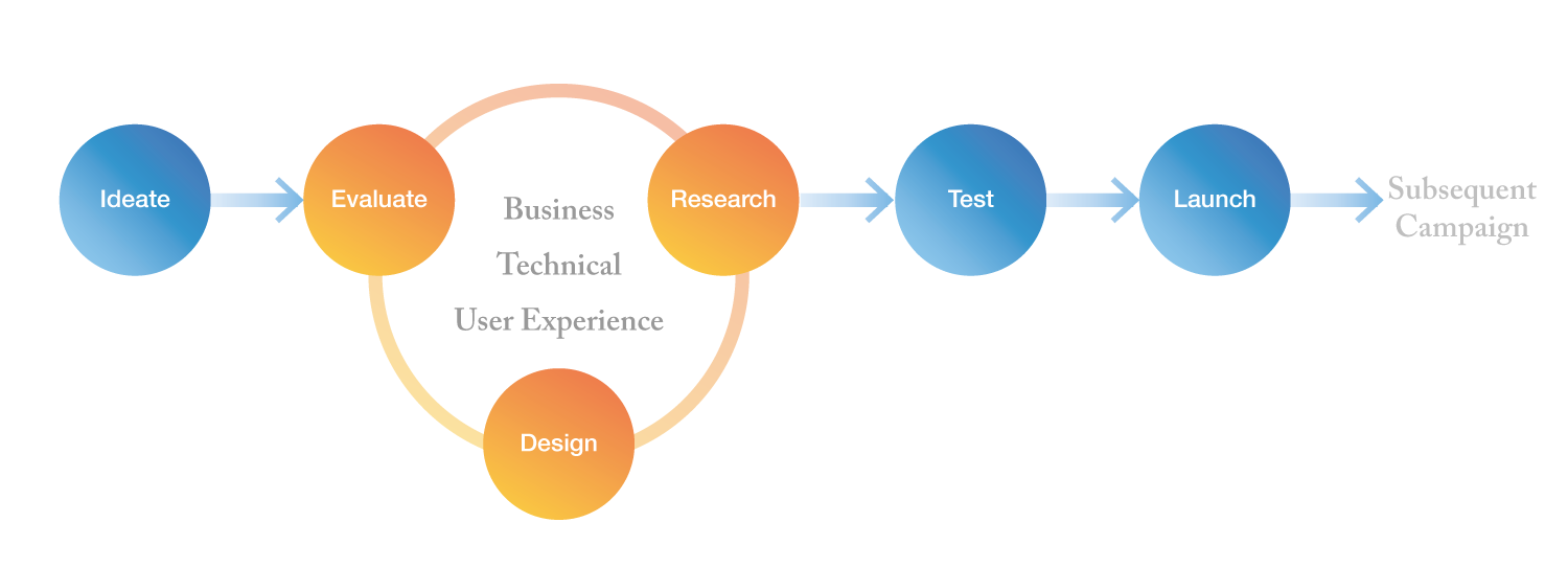
As the only designer on the team, I worked closely with PMs and operational managers to design promotion strategy and control user experience. I also met with my design mentor every day to critique and iterate the design. Different from school projects, the launched projects required designers to control more aspects on design quality, such as legality of design and developing implementation.
Strategy Design
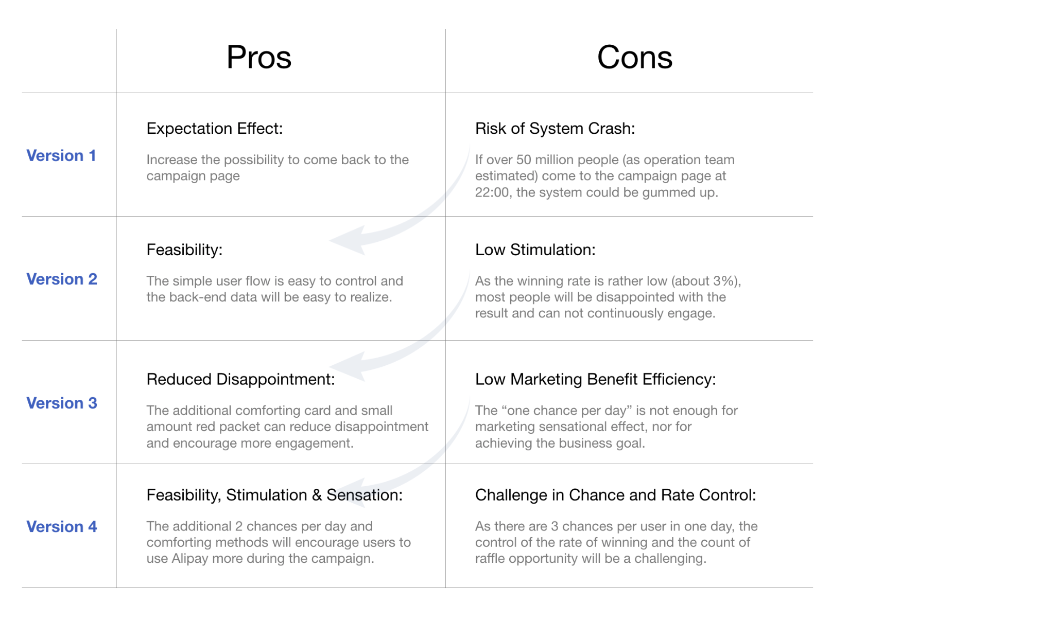
Ideate the Strategy and Evaluate with Business, Fund and Technical Teams
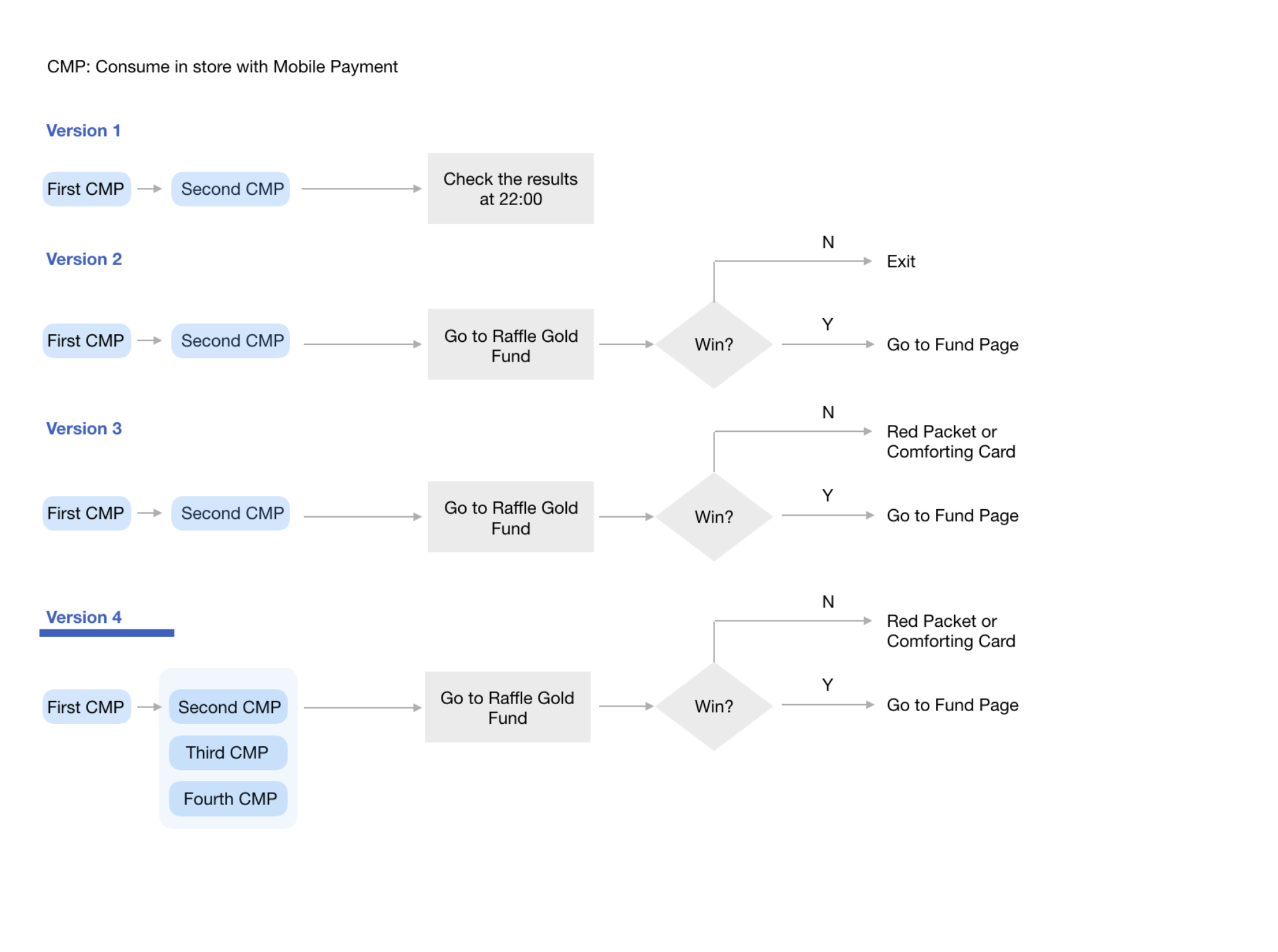
Why we choose version 4
Research
Goal
- To understand promotion design in Chinese context and user mentality in lottery activities.
Methods
- Researching on lottery psychology by literature review
- Analyzing user journey and developing contextual scenarios
- Analyzing cognition loads throughout the process of the promotion
- Conducting 5+ interviews with Alipay users to userstand their attitude to promotions
- Studying other promotion cases to understand how Chinese companies design promotions for Chinese Market
User Journey Analysis
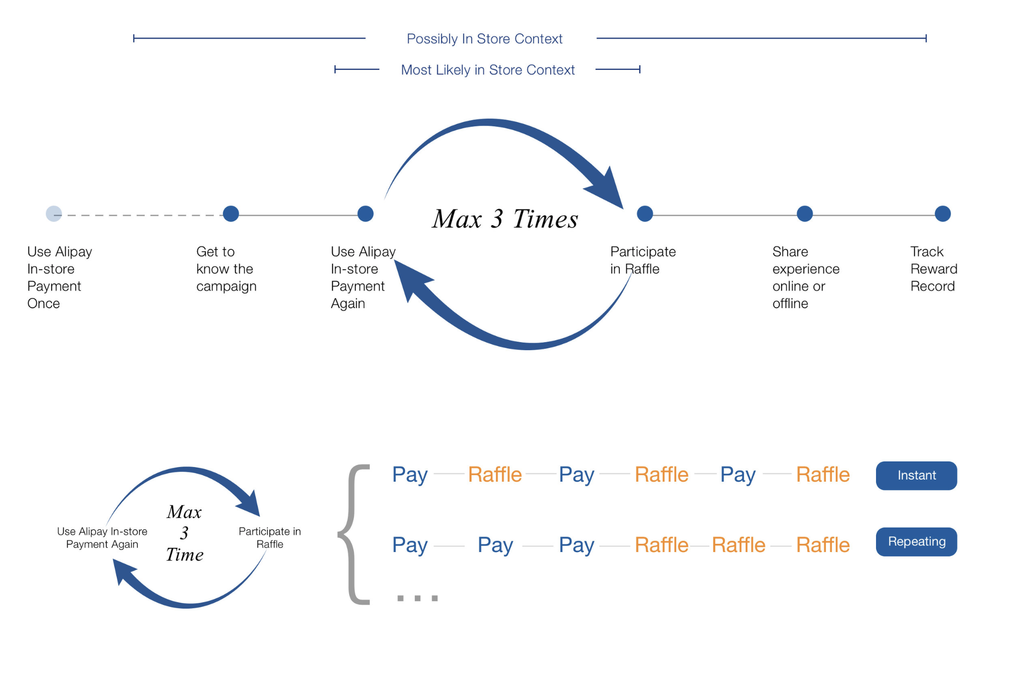
According to contextual observation, users will either close the invoice page immediately after payment action in store or come to the promotion page to raffle repetitively. The time they can pay extra attention is fairly short (in a second or millisecond).
User Mentality
Lottery Psychology
- Unrealistic Optimism Concerning Probabilities.
- The Availability Bias
- Superstitious Thinking & Gambler’s Fallacy
Cognition Loads
Before
Theme of the campaign
Time of the campaign
Rewards of participation
Rules of participation
Current progress
The number of chances
The meaning of “win gold”
During
How to win
The content of agreement
The meaning of “gold packet”
The meaning of “in-store packet”
The meaning of “gold” reward
The way of sharing
After
My reward record
The places for checking rewards (“gold”, “gold packet” & “in-store packet”)
The way of using rewards
Legality Evaluation

Because the promotion is related to fund trade, the legality issue is seriously concerned. I worked with legality department and evaluated the design together. The agreement of opening the fund account should be signed, but from UX perspective, it is obstructive in the user flow. In the end, we agreed that users only need to sign that agreement in the first-time participation.
Design Goal
-
Easy to Understand
Design short user flow, concise promotion information and intuitive agreement signing process.
-
Continuously Stimulating
Control winning rate and design comforting methods to stimulate users participate in the activity continuously.
-
Widely Disseminated
Make use of lottery psychology such as availability bias to amplify the social influence of the promotion.
Prototypes
Interaction Map Design
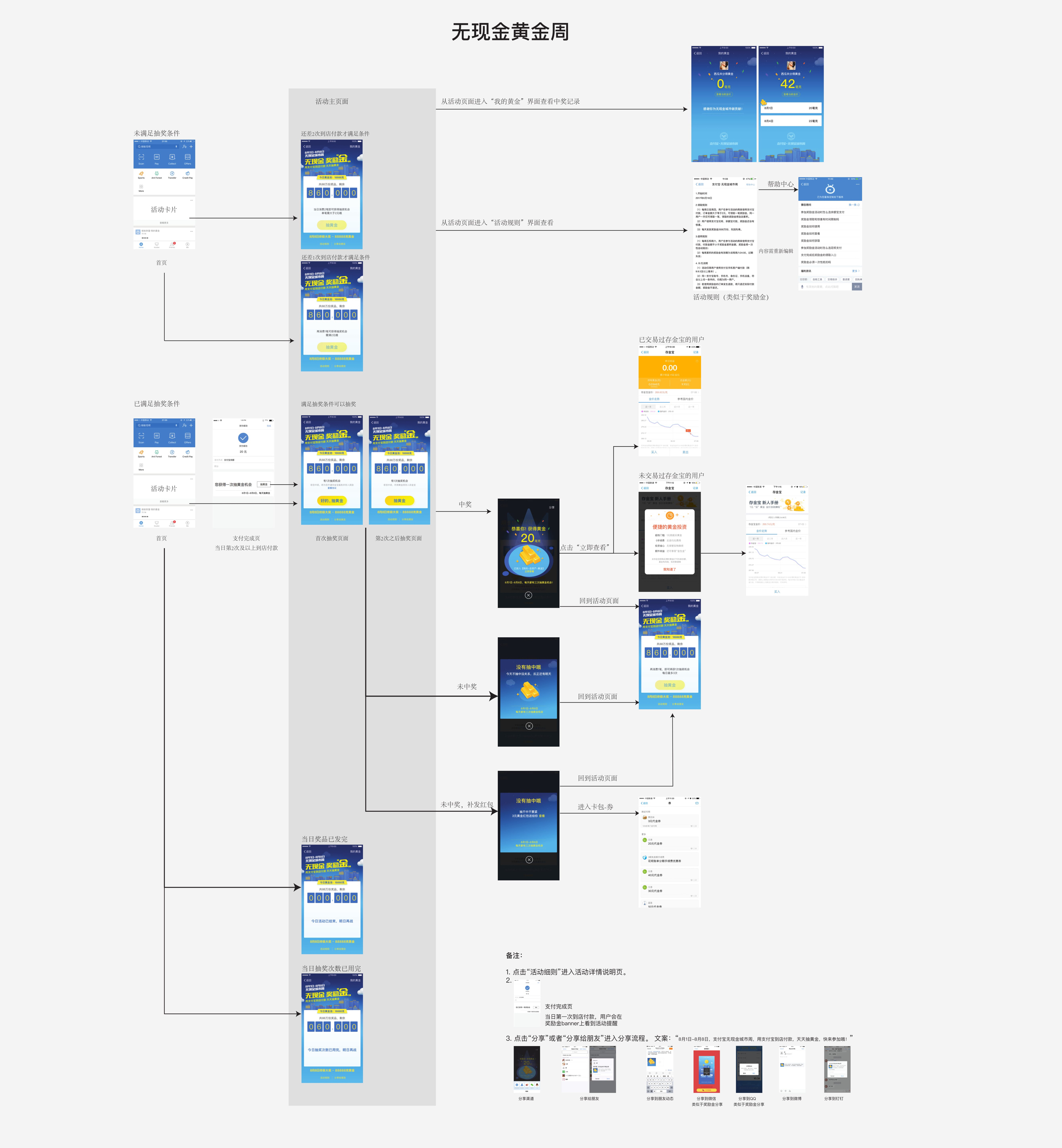
Different from school projects, the launched projects required designers to control more aspects on design quality, which include the reasonability, effectiveness, and legality of design, as well as the quality of developing implementation.
Optimize UX of Signing Agreement
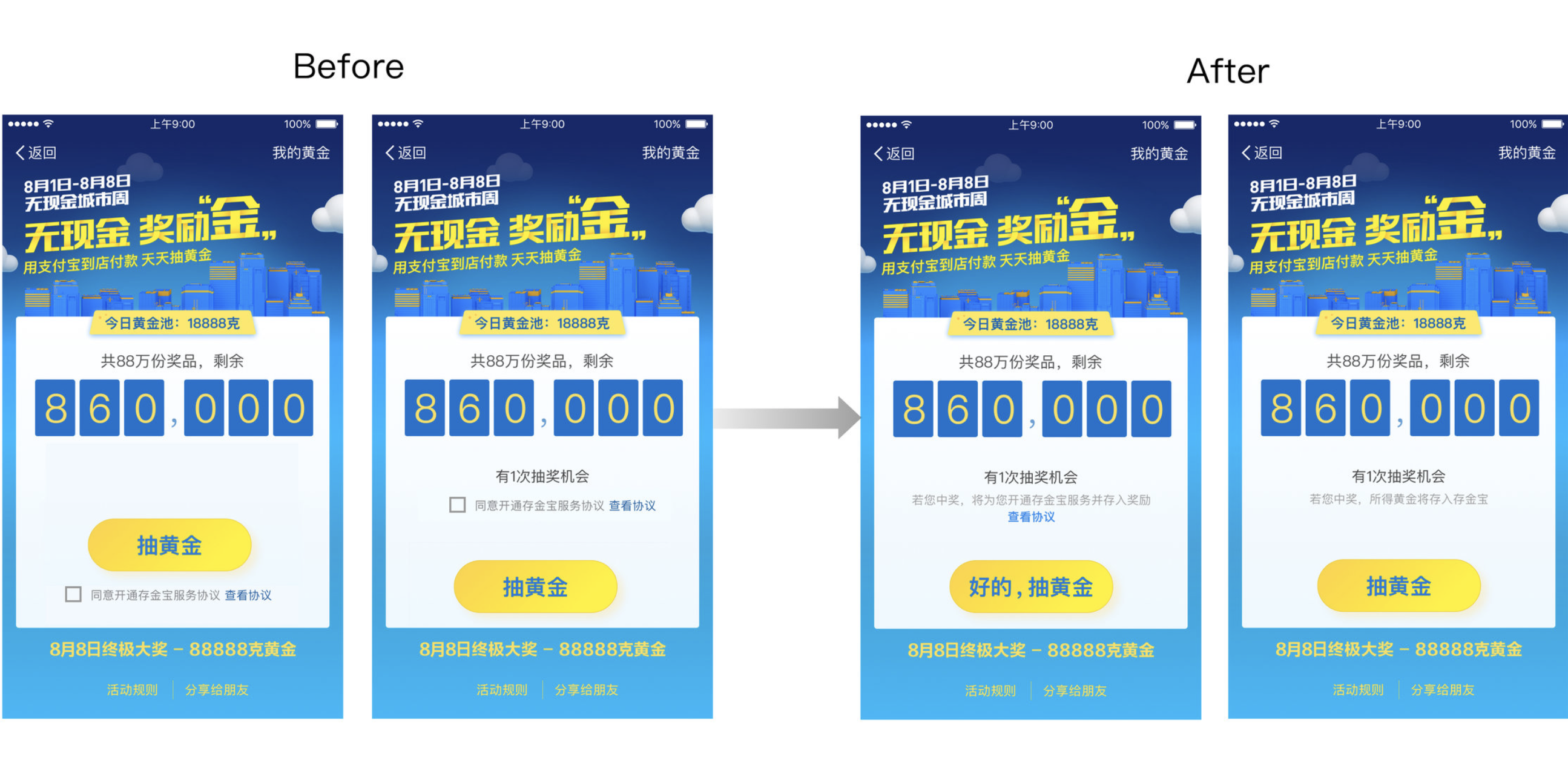
I tried to design the page to keep the perception of signing an agreement as well as to minimus its obstructive feeling. Considering about the reading sequence from top to bottom and the actions users need to take, I changed the position of the agreement from bottom to top, delete the check box and change the text content on the button for the first-time participation.
Focus on Promotion
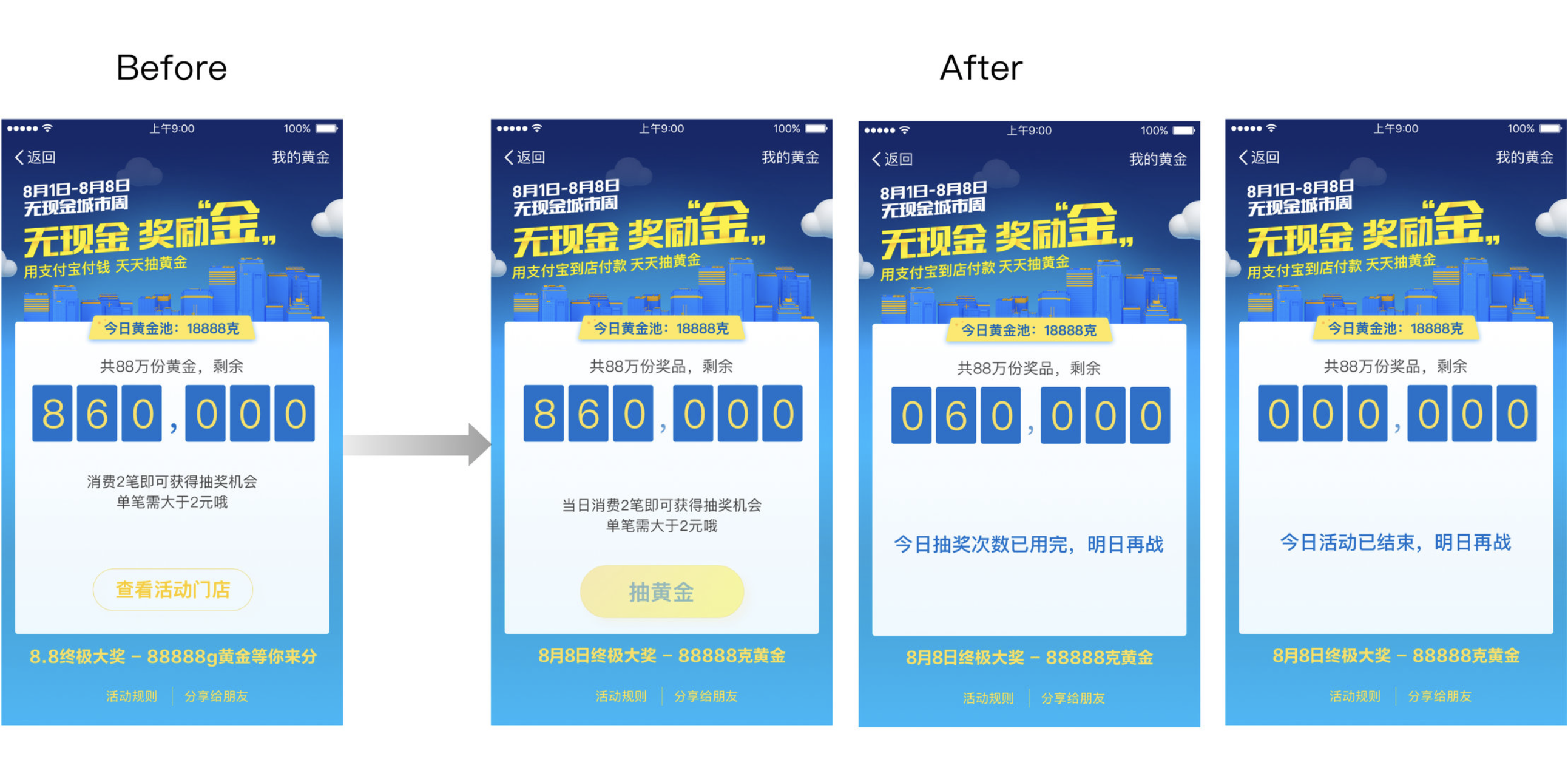
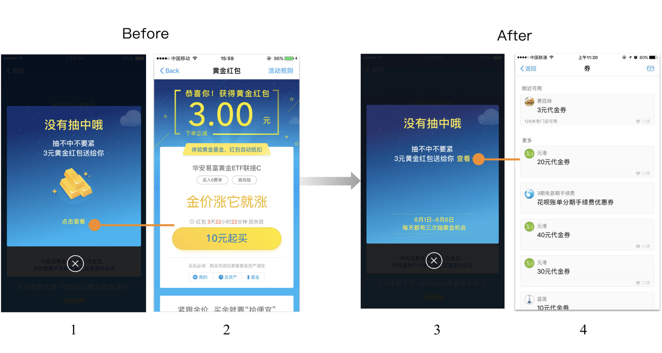
The promotion should be easy to understand and simple for the instant and repeating using contexts. Thus, we decided to remove some path, such as when the user is unable to participate, just display the page without actionable button instead of directing them to other promotions.
As the same reason above, if the user did not win a reward but was given 3RMB fund packet, the button will direct them to their familar pocket page instead of fund page.
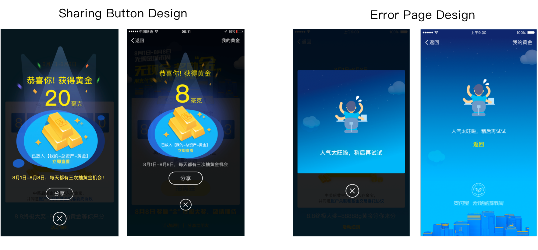
Sharing Button
If people share the winning page, others will think there is a large chance to win. Sharing is important. The visual designer and I worked together to adjust the visual design of winning page. Sharing button was emphasized and put away from close button.
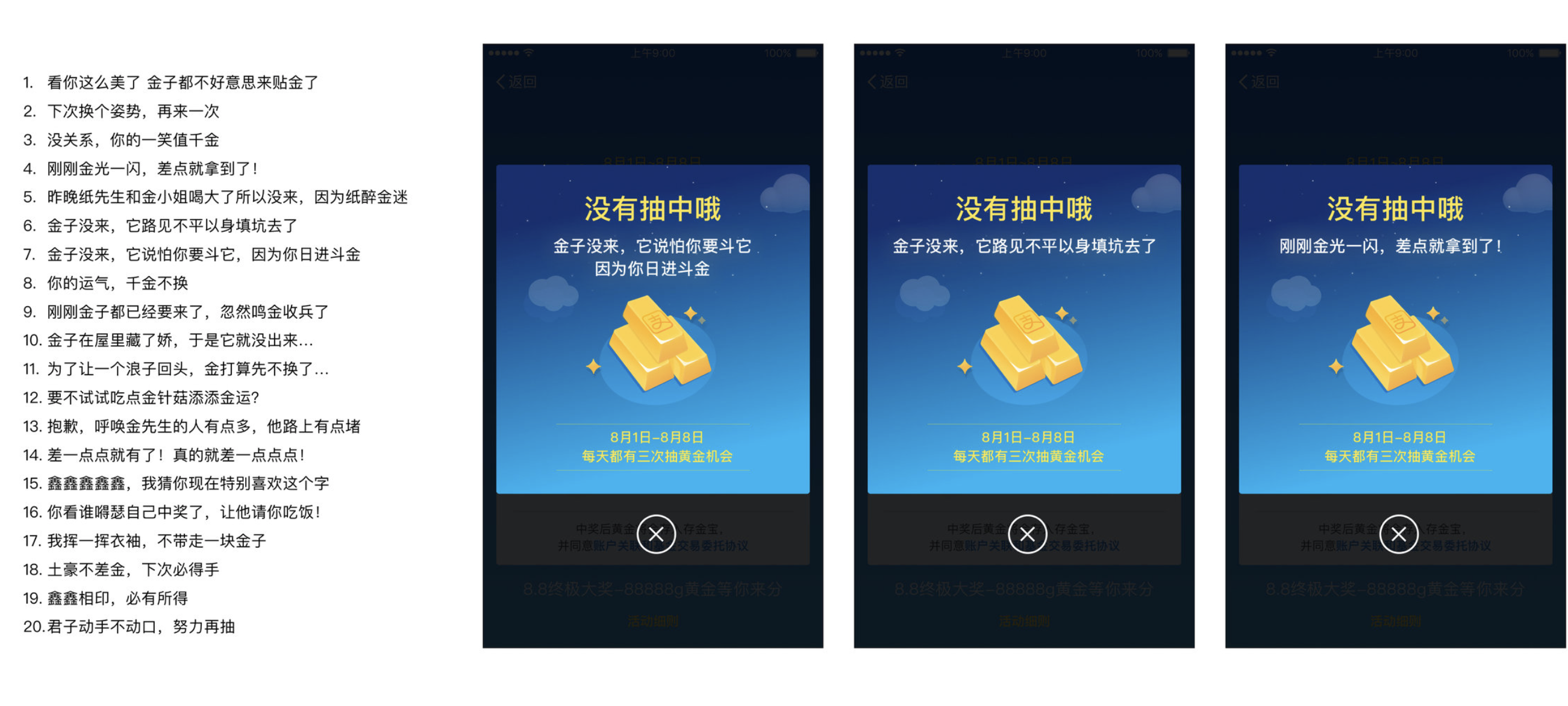
Content Strategy
As the winning rate is rarely low, comforting the users will be important for the continuous participation. My teammates from operation department suggested me that people will feel relaxed if they hear jokes or get small comforts when they lose the game.Together with marketing team, I contributed to the content strategy of the pop-up notices for losing the raffle.
.
Quality Assuarance
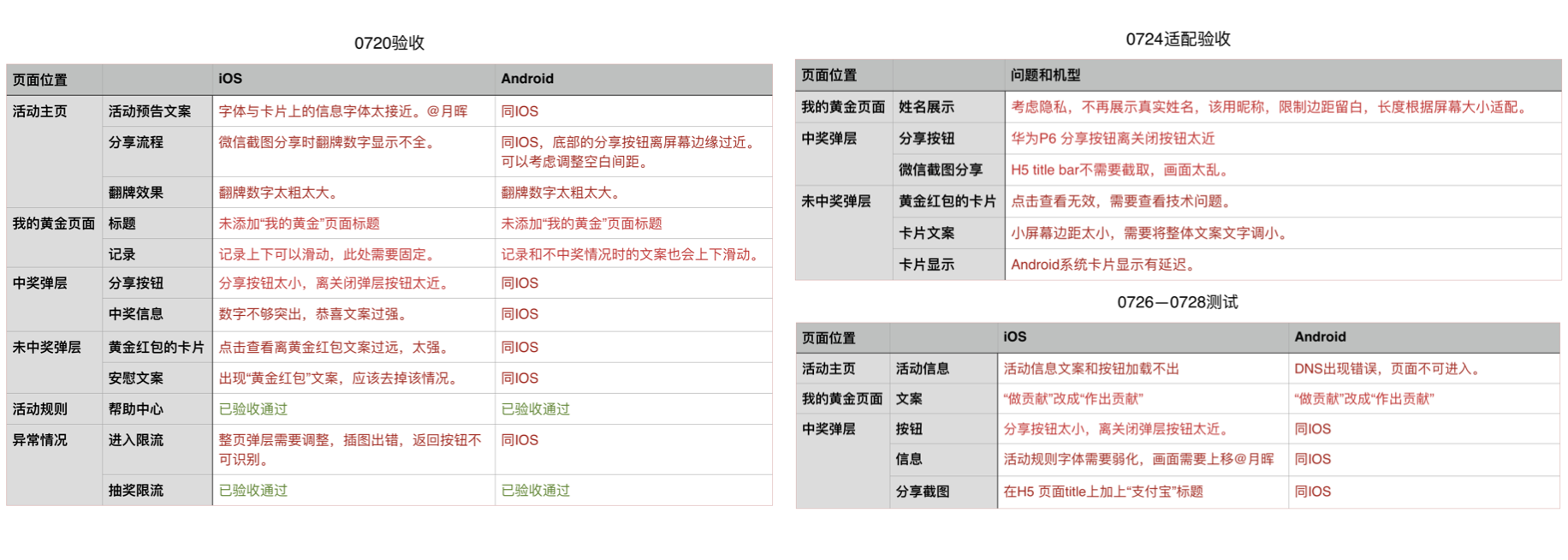
As Alipay has over 500 million users, design implementation and quality assuarance are extremely important. As a designer, I took responsibility of quality assuarance in the end of developing stage.The main aspects that I checked are:
-
Capabilities of user interfaces
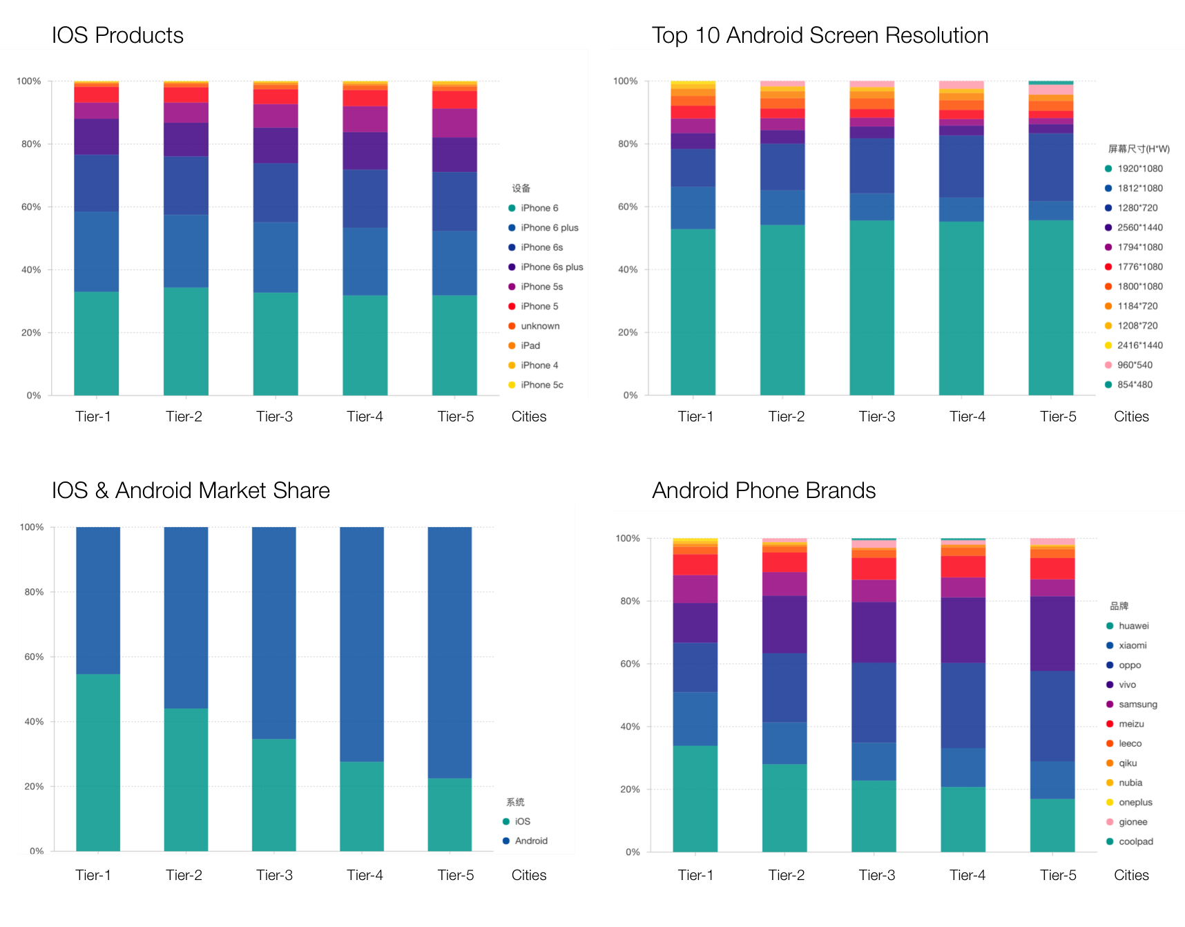
As the bar chart shows below, the phone type is rather diverse in Chinese market. We need to make sure the designed user interfaces could be displayed and function well on every type of phone.
-
Over 70 possible conditions
Although the workflow is simple, there are over 70 conditions such as different erros in the back-end. I need to check that users could get proper feedback or land on proper page in every condition.
-
Information Visualization
Worked with visual designer and developer, I checked that the visual design and developing did not influence the information hierarchy of user interfaces.
The Current Situation of Phone Use in China
My Notes in July 20, 24, 28 (Read means problems)
.
My Impact
-
To get an increase on mobile payment by 70 million in 5 days
I participated in promotion strategy design and contributed my insights from user experience perspective. I also designed three prototypes to get quick feedbacks from business and technical teams.
-
To get positive public opinion in general
I worked with developers to assure the capability and quality of design solution. Users encountered faily few problems during the promotion, and public feedback is positive in general.
-
To create a template for the future promotion
After the promotion, Alipay decided to continue it on every Friday and Saturday in August and October. They used the same template as I drew in summer and only changed the visual style.
Reflection
From this project, I learned how to approach design solutions collaboratively within a multidisciplinary team and how to evaluate design solutions for the product with huge user base.
-
Discuss goals and constrains in the early stage.
In real industry, designer is responsible to reach business goals and create the best user experience within business and technical constrains. The ignorance of goals and constrains will cause the failure of design.
-
Think about legality problem.
When the user base is large, the challenge of design are not only from users, but also from public and policy. As a designer, we need to think about risks about legality.
-
Think about the whole product when designing a single function
When designing a small function for a supper application, it is easy for designers to overestimate the importance and thus destroy the overall product experience. Designers need to evaluate design solution by keeping the whole product in mind instead of mere one function.
-
Be responsible for the product, not only the design
The outcome of developing may be not exactly the same as the design deliverables. I had to work closely with developers to control every detail of design implementation.
-
Change your mindset and always respect the market and users.
As I gained design knowledge in UK and US, I need to keep learning Chinese users and design approaches with humble mind. In China, promotion is a popular approach to seize market share, while it is rarely seen in US. The widely-accepted design style is also greatly different between the two country.