© Ru Jia 2017 All rights reserved.
ALIPAY VISUAL IDENTITY
Alipay is facing challenges for branding identity because the mobile app incoporate too many functions from different business units. As an intern, I participated in brand style guide formulation from research to application.
To comply with my non-disclosure agreement, I have omitted and obfuscated confidential information in this case study. The information in this case study is my own and does not necessarily reflect the views of Alipay.
Date
July 6 - Aug 28
2017
Team:
Alipay UX Design
(Branding Research Team)
Responsibility
Product Research, Visual Research, Style Guide Analysis
Problems
Too many functions and business units
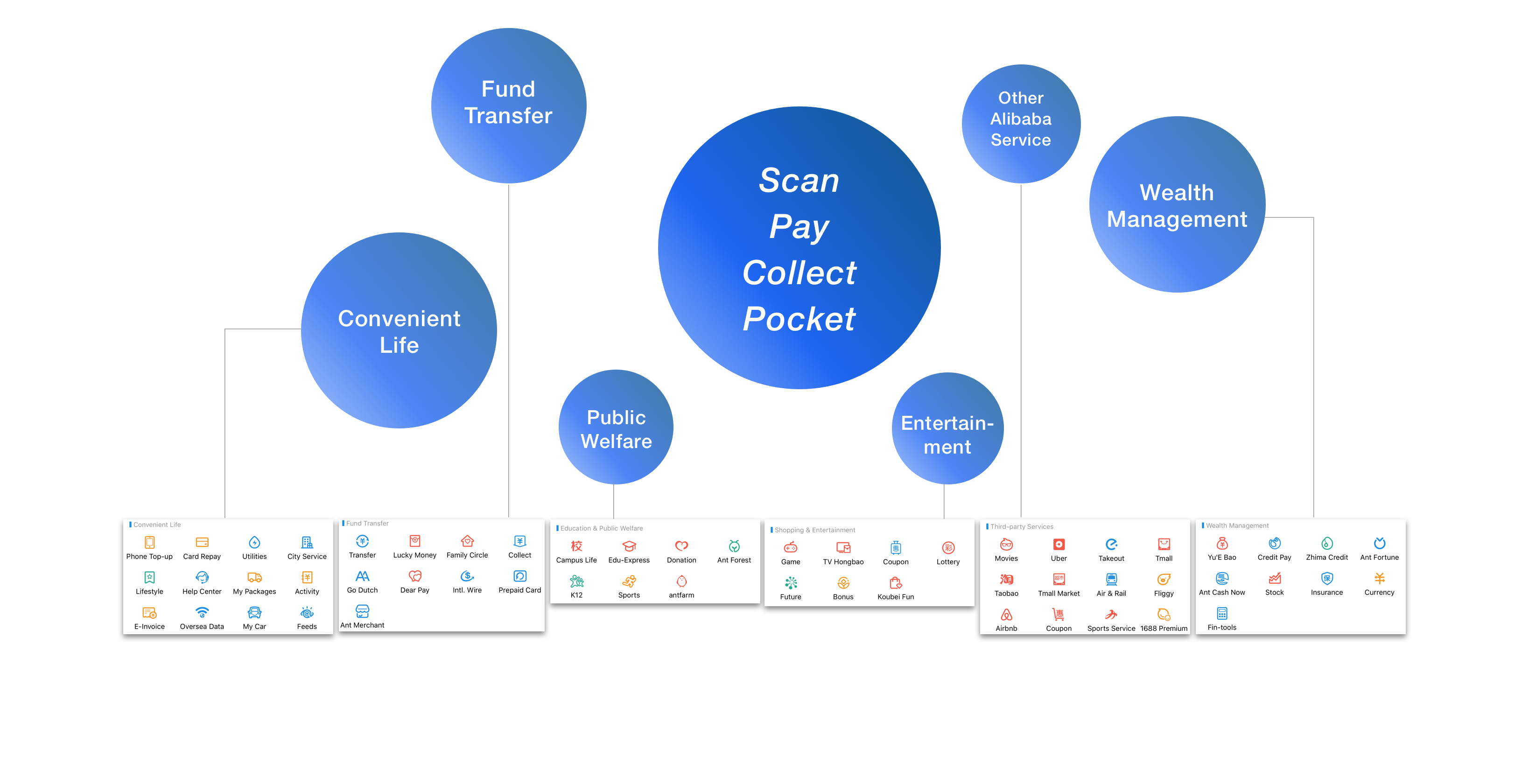
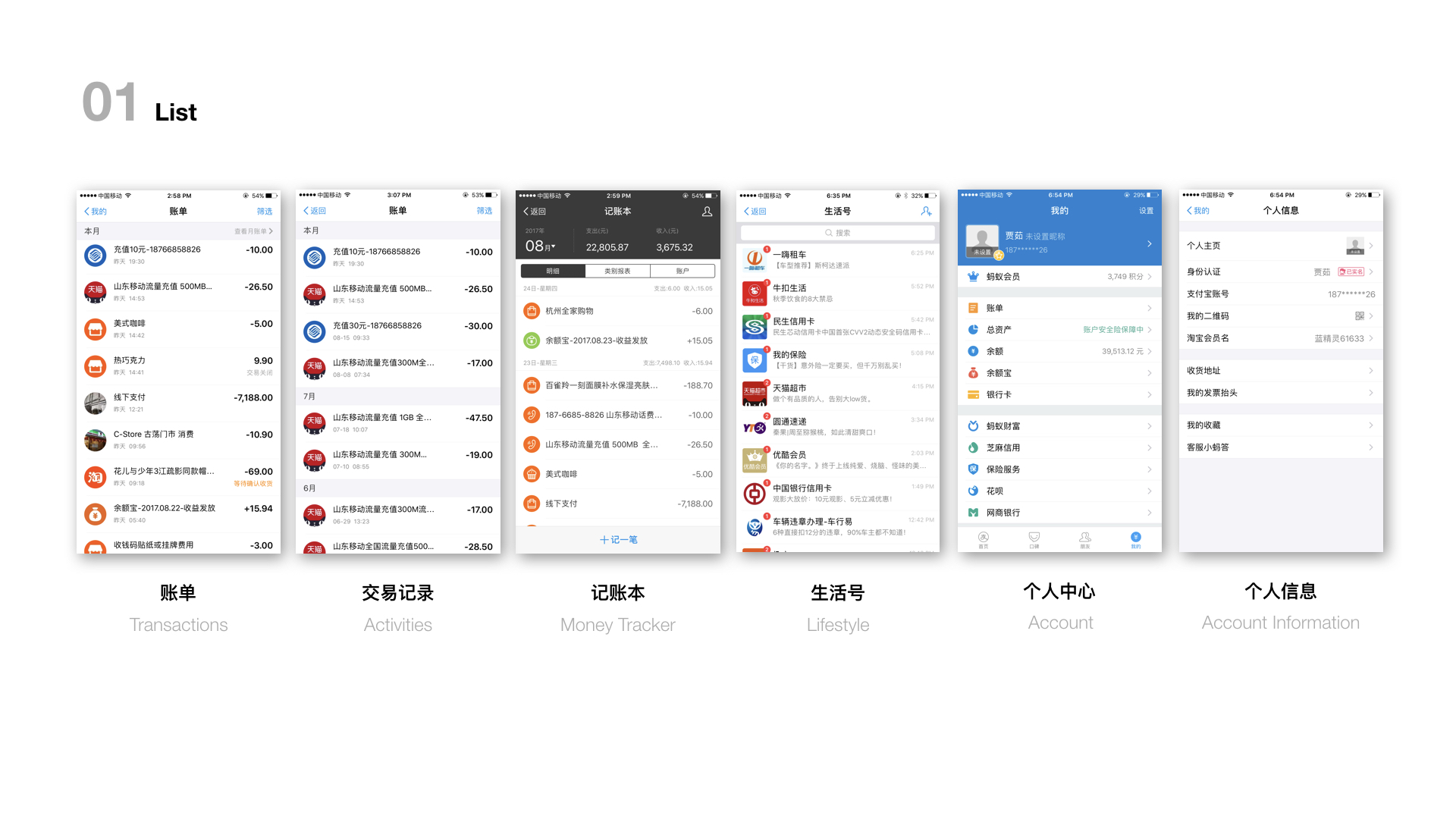
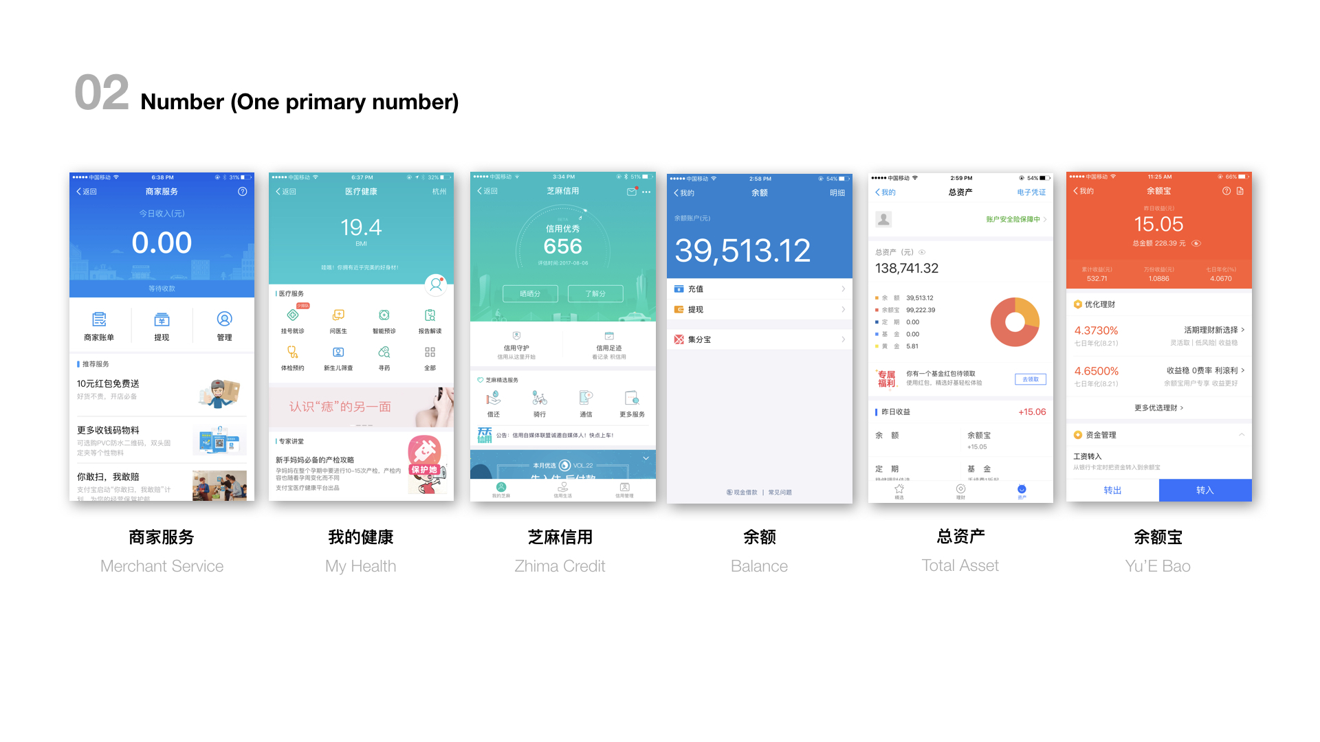
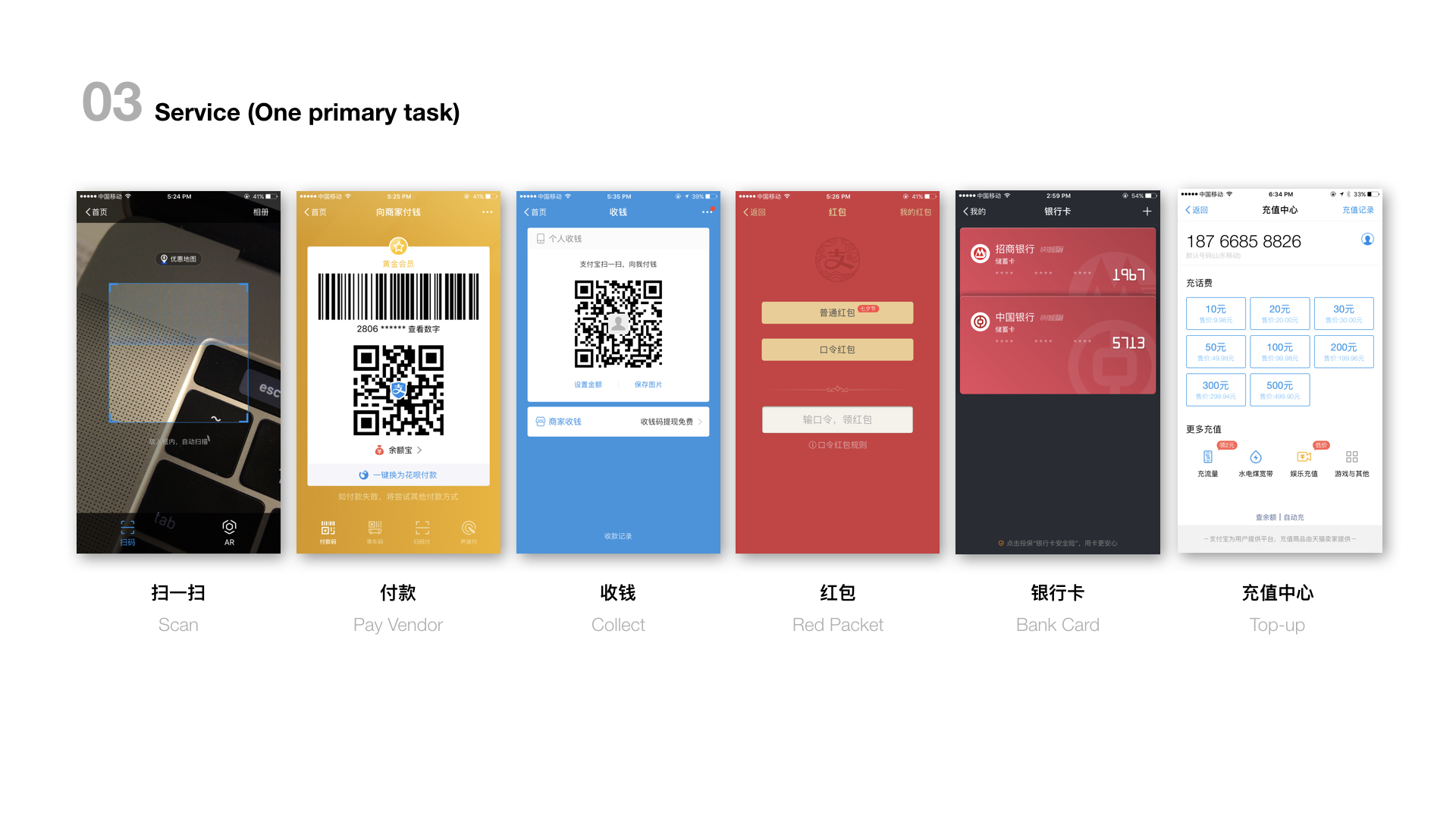
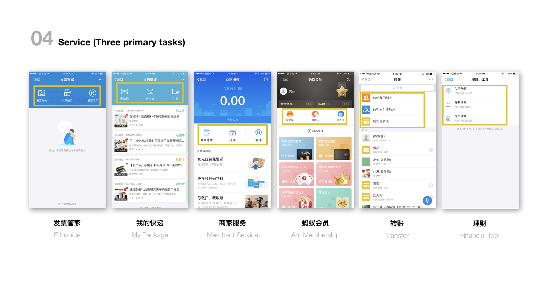
Based on its primary four functions - scan, pay collect and pocket, Alipay offers a wide range of services. Over 70 of them could be regarded as a sub-application for each. These business units have a lack of communication on design style and content, which leads to a serious problem of branding awareness and efficiency of use.

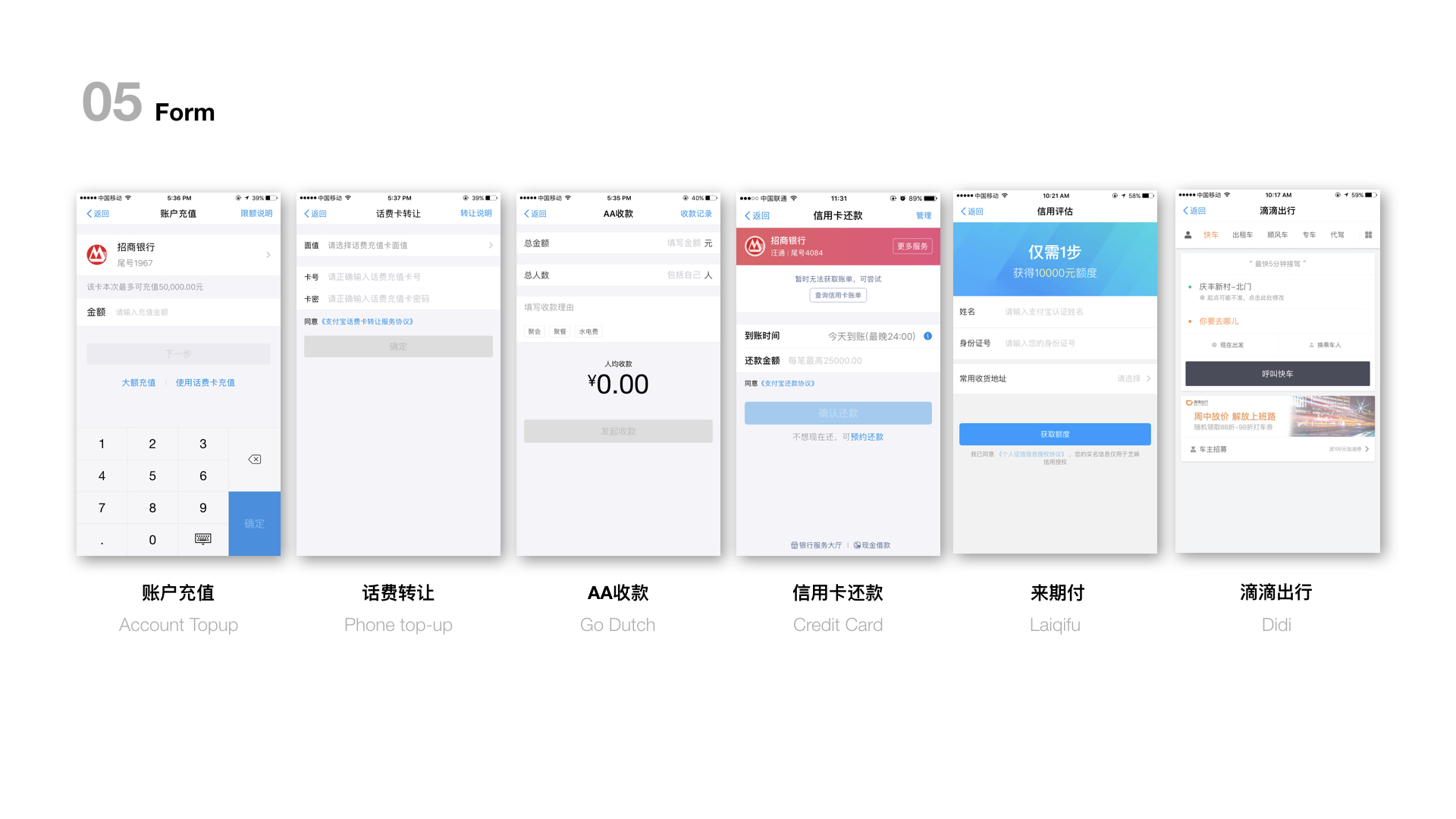
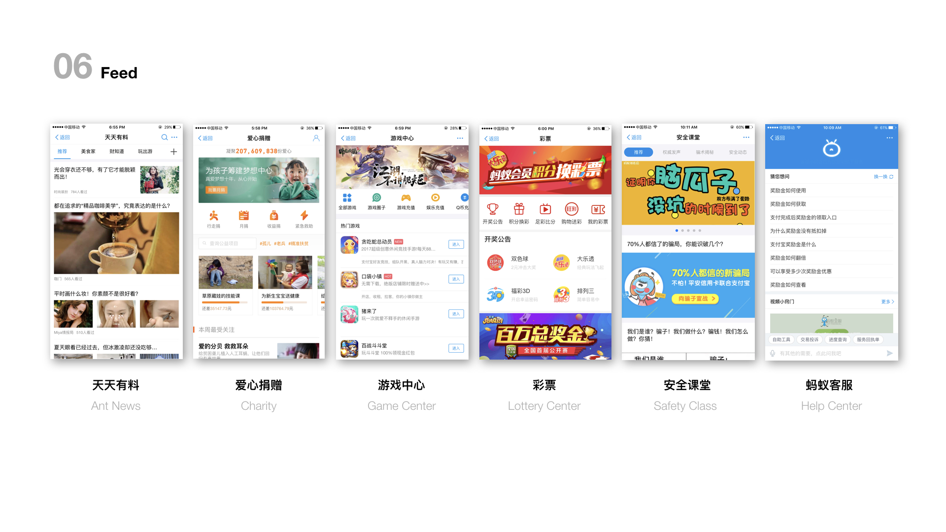
The 5 screen shots could be an example of the problem. They have similar information structure, but presentations are so different. A branding style guide is necessary for the super app.
Challenges
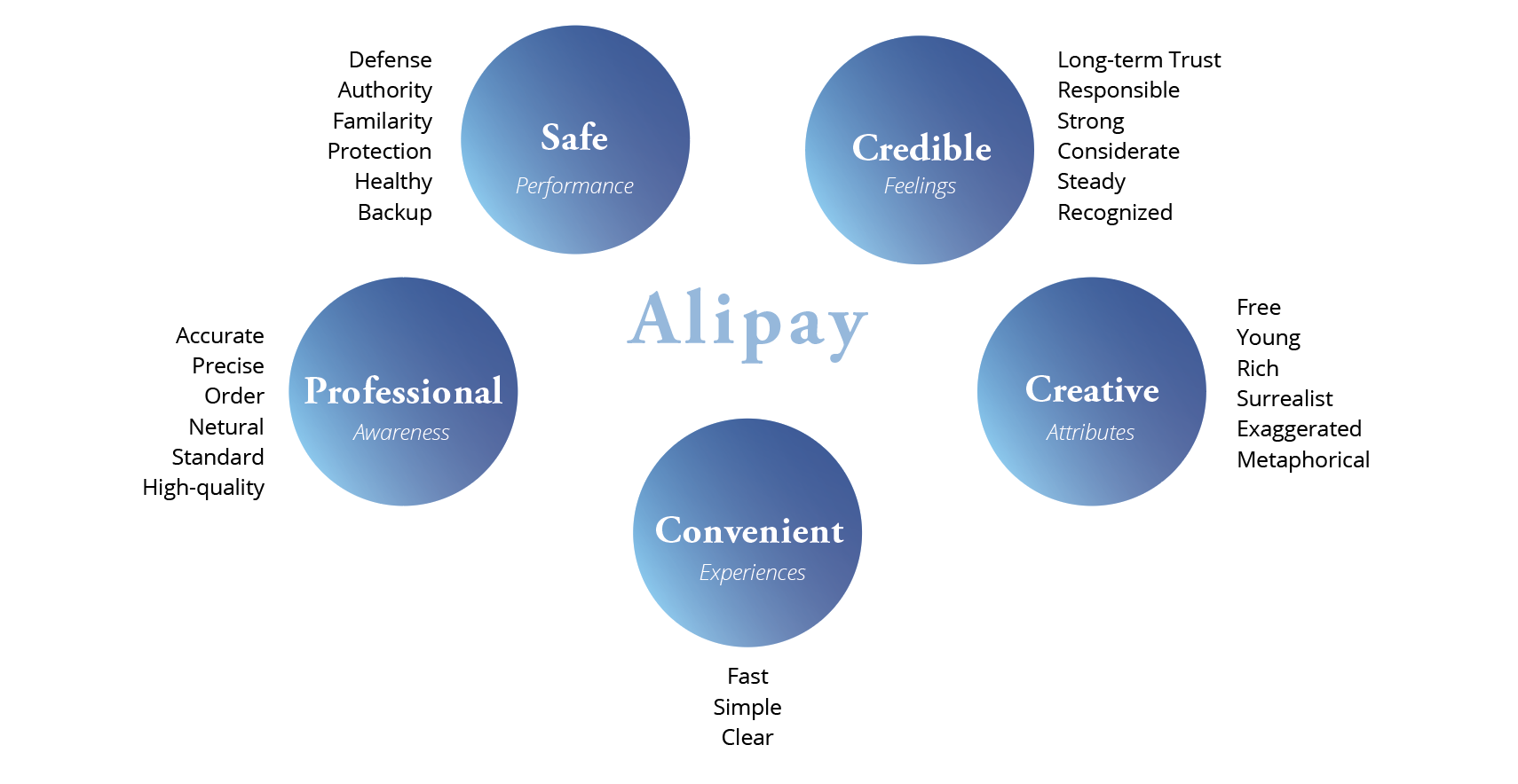
How can we convert the abstract branding key words into design style guide for the complex super application?
Process

I joined the Brand DNA Research team at "associate" stage and left before finalizing the branding style guide. I participated in most parts of the research process.
Key Words

The concluded 5 key words are provided by business development department. They got these words from market strategy analysis and widely-distributed market survey.
Mental Map
In this stage, all team members researched on various branding design and industrial design that has the similar mental map as Alipay. My group still focused on "credible" attribute, though, all team members made the whole matrix together during the meeting.
Mood Board
- Credible
- Professional
- Safe

- Convenient

- Creative
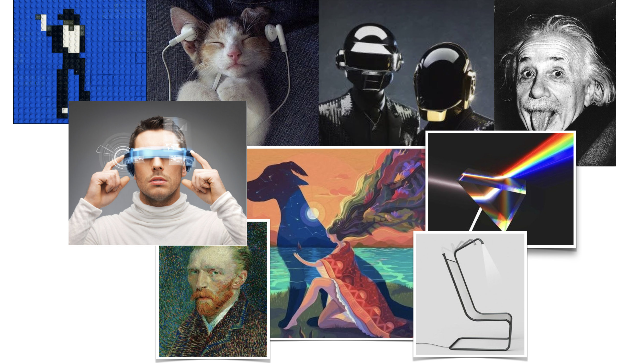
Mental Map
Visual Principles
In this stage, all team members researched on various branding design and industrial design that has the similar mental map as Alipay. My group still focused on "credible" attribute, though, all team members made the whole matrix together during the meeting.
Exploratory Research
Key Findings about Color
- Blue is closely related with credibility.
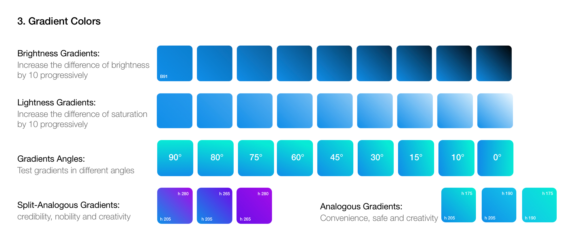
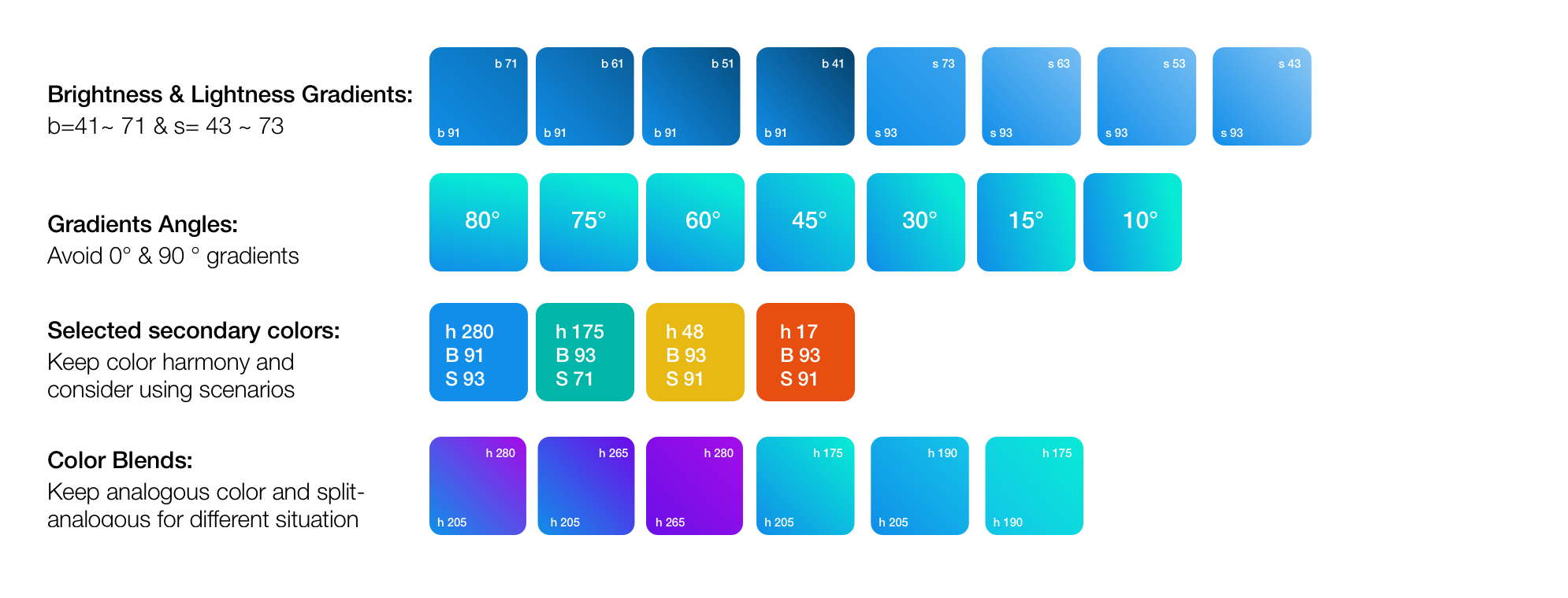
- The brightness and lightness should not be too high.
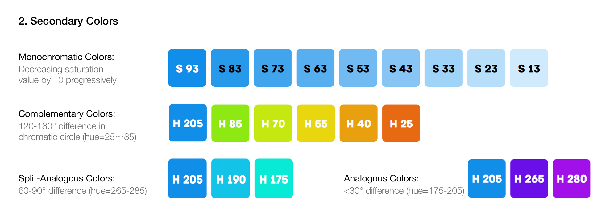
- There should be some secondary colors for sub brands.
- Blue (for brand and steady), green (for health), and orange (for alert) are three main range of color study.
- Gradient should be cleverly used to enhance the sense of innovation and technology.
Color Study
All the analyses were based on the current brand color #1091E8(Hue:205; Brightness: 91; Saturation: 93)

Visual Identity
Application
Analyze the Product
